Home Is Where The Heart Is : Everything You Need To Know To Make Your Living Room Zing
Your artworks are an expression of who you are. And when you give sculpture or wall art pride of place in your home, their texture, scale and colour give your rooms immediate warmth and character. Here, we look at some of the key considerations around how to show off your pieces to their best advantage.
What’s in and what’s out in 2026? (Does it even matter?)
Experts universally agree that it would be tragic if buyers allowed their judgement to be swayed by what’s in and what’s out of fashion. The only justification for owning an artwork in the first place is that it resonates with you emotionally. This might be because of its heritage, the story it tells, or simply its beauty. It doesn’t matter whether you’re lucky enough to have inherited a Gustav Klimt, you’ve built up a collection of art prints fit for a gallery wall, or you fell in love with a sculpture years ago and want to give it a place that does it justice. Whatever the subject – seascapes, pop art, indoor sculpture, botanicals, portraits or abstract landscapes – let it be seen so that you, your family and your visitors can enjoy it too.
That said, for new buyers of artworks there’s a discernible move away from the perfection of digital art to the authenticity of handmade objects. At the time of writing, this could be interpreted as a need to offset the tension caused by global instability. In troubled times, we tend to surround ourselves with reminders that deep within our consciousness there’s a powerful sense of humanity which will prevail when circumstances permit. For now, art provides a cocoon, a private space to which we and our loved ones can retreat from the noise.
Should art reflect the architecture surrounding it?
Not necessarily. If we look around the cities of the world, we see many examples of contrast between art and architecture. The contemporary glass Louvre Pyramid in Paris, France, springs to mind, designed by IM Pei to work in opposition to the 12th-century French Renaissance palace behind it. Also, Prague’s Dancing House, which was created by Frank Gehry and Vlado Milunić to break away from the surrounding Baroque, Gothic and Art Nouveau buildings.
Such boldness doesn’t come without occasional grumbling, but any discontent tends to fade once a challenging piece settles into its environment and becomes part of the culture.
This surely demonstrates that there’s no need to stick to modern art if your home is a contemporary cube in a desert. On the contrary, the softening effect of traditional sculpture and wall art might be welcome. The same goes for the other way round: if you live in a classic Victorian villa – an architectural style known for its romantic eclecticism and rich decoration – by introducing a note of simplicity through the addition of pared-back artworks you will bring balance to the room. There are rules, yes, but sometimes interiors benefit from breaking them in an intentional, knowing way.
There’s another smart way to ensure that sculptures always suit the style and décor of a living room. Introduce mirror-polished surfaces such as stainless steel and observe how an artwork becomes one with the room, reflecting the colours and architectural details around it, visually expanding and brightening the space, and blending in yet standing out.

Louvre Pyramid
Harmony or contrast?
It’s an age-old question: should art complement your home décor, or has it earned the right to be displayed simply because you love it? Most would agree that if an artwork occupies a place in your heart, then it has definitely earned a place in your living room. And if it’s quirky, so much the better because it reflects who you are. Beyond that, it’s a straightforward question of how to make it work with the space, the light and the furniture.
Where wall art is concerned, it’s down to how busy or restful you want your room to be. For example, use a large artwork to anchor a room’s colour palette harmoniously by choosing soft furnishings in accent colours taken from the piece. This will pull the room together visually. However, if your décor is heavily patterned, then an equally busy piece of abstract wall art will be lost in the visual clutter, so choose something calmer. For backgrounds that are neutral or muted, opt for something with punch and heft, and see how it changes the energy of the room.
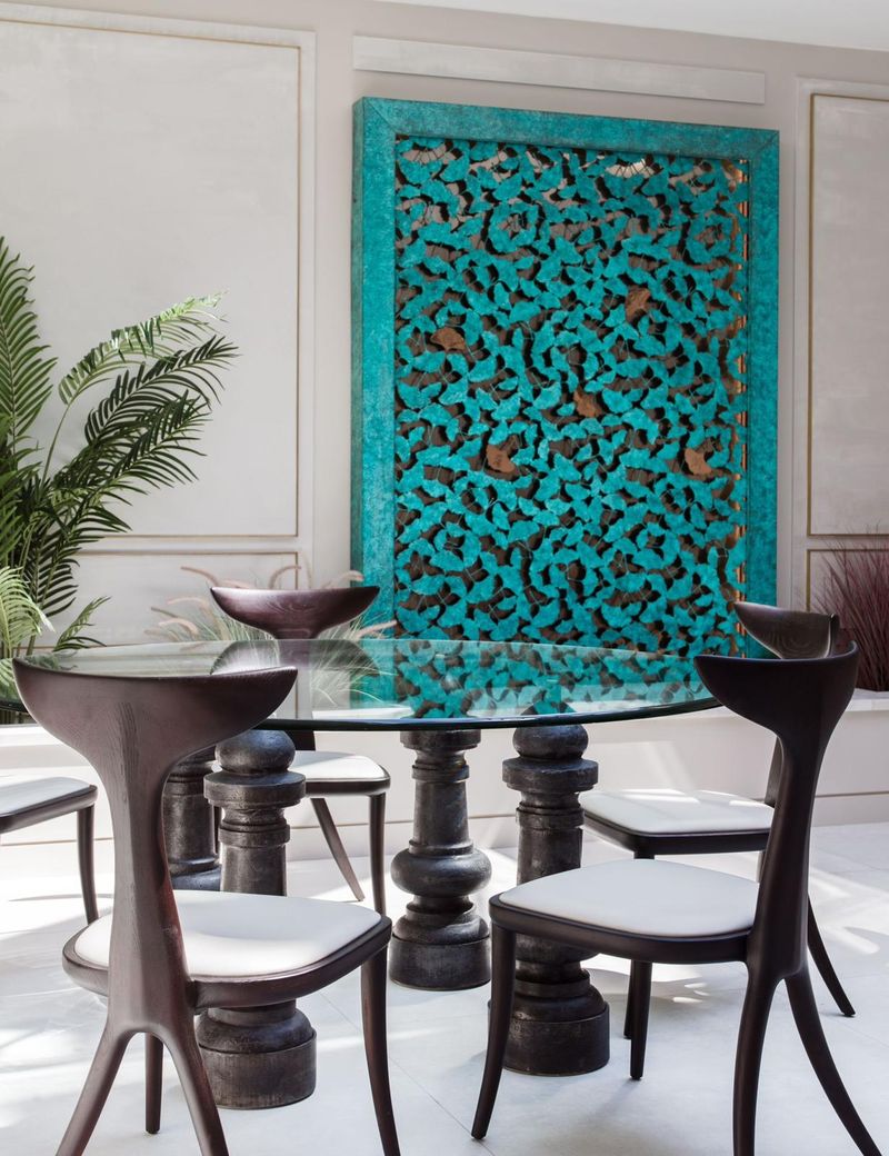
Ginkgo with a round glass table and contemporary chairs in the foreground shows how to punch up a muted, minimalist space.
A useful rule of thumb is to find commonalities that eliminate any sense of decorating overload. Framed art is one way to achieve this. If you have a disparate collection of paintings spanning every genre, colour spectrum and subject matter without an obvious linking thread, simply frame them similarly and these framed prints will then gel as a group.
When all’s said and done, whether to clash or to complement is a personal decision. But remember, if you choose to clash, make sure it looks intentional rather than a mistake!
Getting the proportions right
Should you choose an enormous artwork to match an enormous space or wall? Scale will always draw the eye, so this will work in terms of maximising impact. But you could also adopt the approach used by galleries: for a big living room, hang your art or position your sculpture as though it has been curated by a gallery professional. To that end, we can borrow a few rules from the pros:
Be wary of direct sunlight. It’s both a blessing and curse when it comes to art. If you position something you treasure in a spot that gets bombarded with harsh UV – think south-facing windows – it will fade and the surface will degrade. Either filter the light or move it away from the window,
Create a focal point. This is the first thing you want people to see when they enter the living room. It might be a wall painted in an accent colour, a sculpture, a piece of furniture, or framed art.
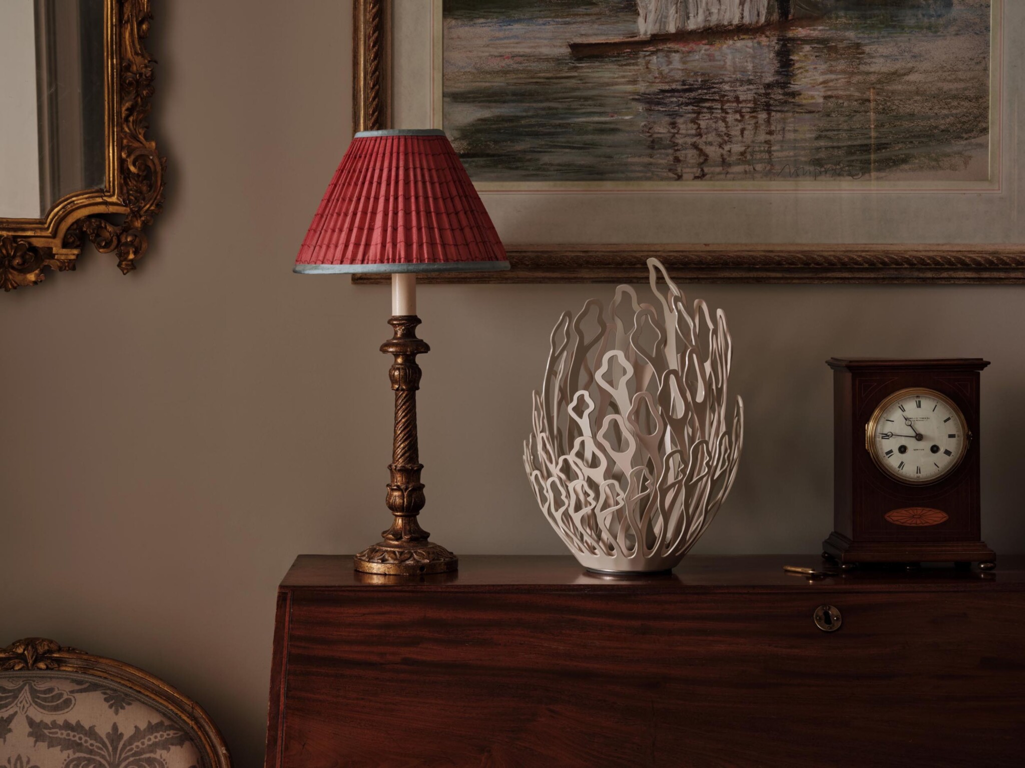
Give a sculpture breathing space. Small pieces are relatively easy to display on a cabinet, occasional table or mantelpiece. Large artworks need more thought. A tall, slender sculpture will draw the eye upwards, making a ceiling feel higher. A piece placed on a pedestal 145-152cm (57-60”) from the floor will confer a gallery-like formality on the space. Think about how you want it to be seen and give it enough room to be viewed from different angles. For after dark, expertly lighting a piece will bring a little night magic to the room, but do seek professional advice. (See ‘How to light your art’ below.)
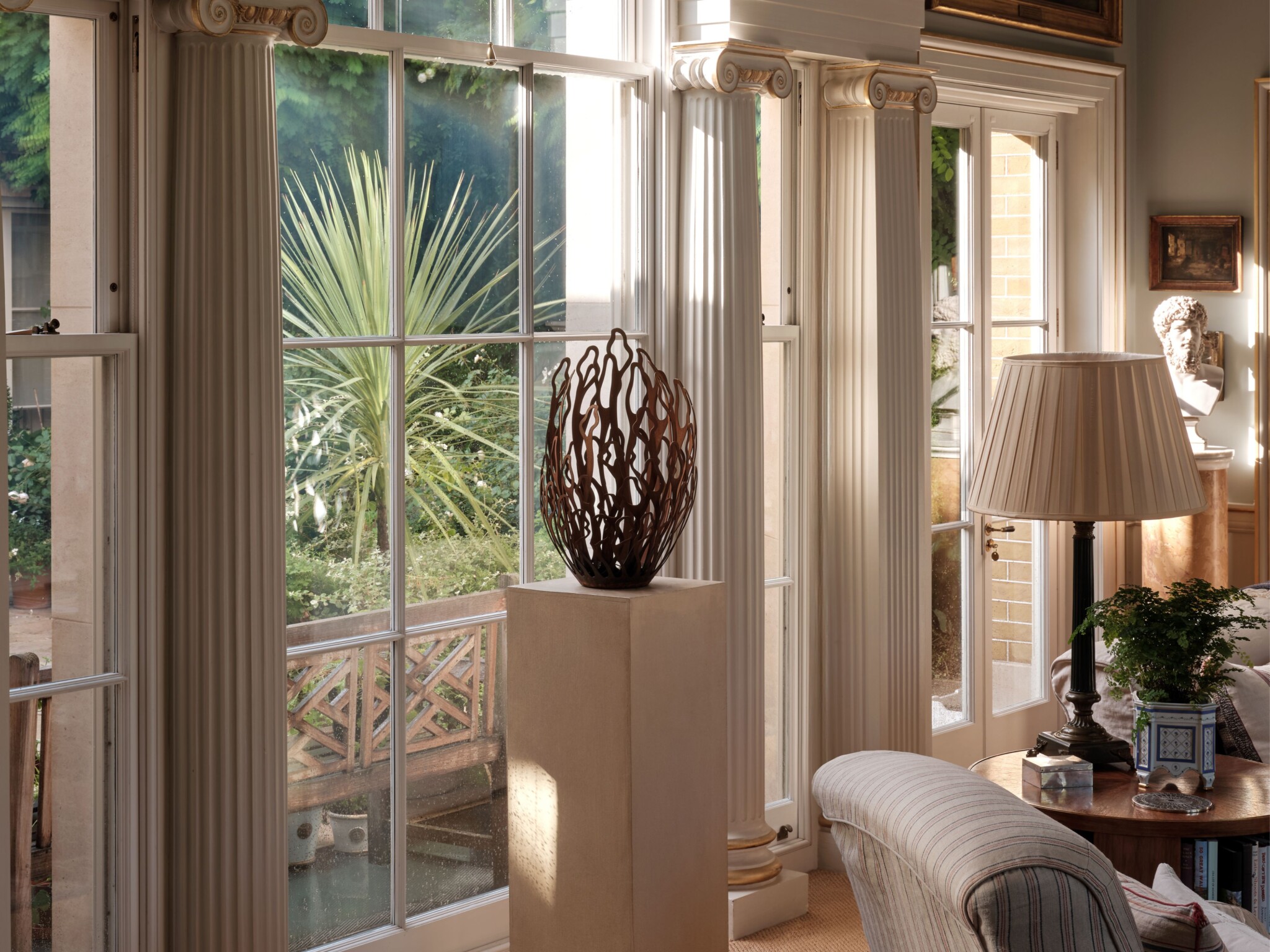
The image of Alba on a cream plinth next to a beautiful window with a cream table lamp on the right shows how to give a piece breathing space.
Arrange smaller pieces of wall art in a cluster. Try to avoid randomly dotting art over a wall. If small pieces are a similar size, create a cohesive look by maintaining a consistent 5-10cm (2-4”) gap between artworks. If they’re destined to hang above a sofa, aim to take up wall space equivalent to around 60 per cent of the sofa’s width and 15-25cm from where the top of its back lines up with the wall. In cases where one item is a good deal larger than the rest, make it the centrepiece of the cluster. Caution: it’s always best to test-drive a formation by laying it out on the floor first before making holes in the wall!
Position art at eye level. Museums have a rule of thumb for large art: allow 145cm (57”) from its centre to the floor. Otherwise, place your artworks so that they’re at eye level for someone of average height. If they’re to be hung in a sitting area, place them a little lower so that they’re easily viewed from a seated position.
How to light your art
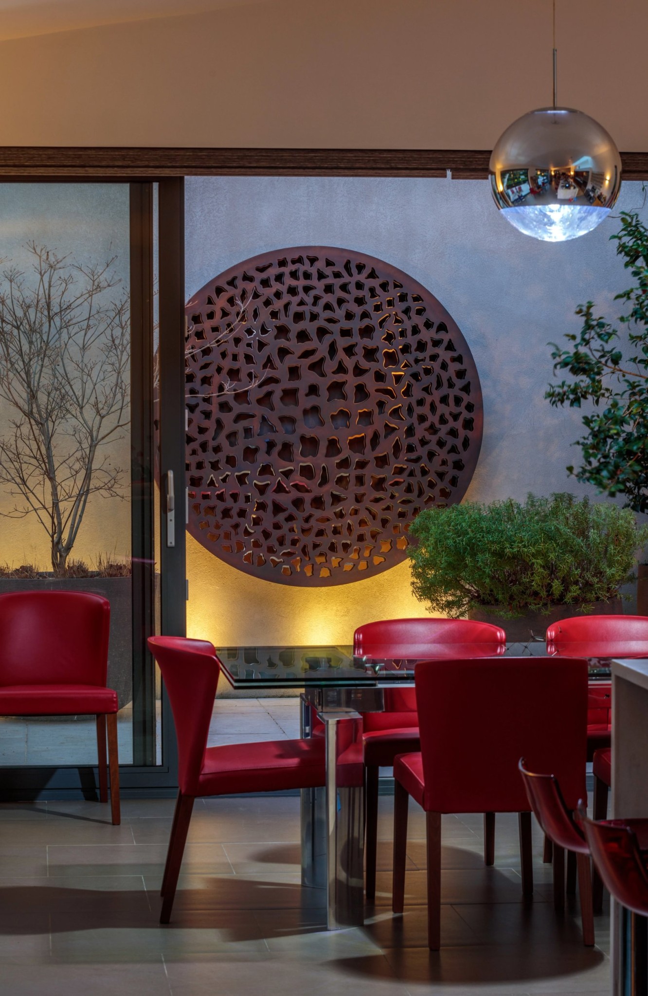
There’s little point in owning beautiful pieces that you leave in shadow, lost and ignored. Besides, colour and texture won’t come alive unless the artworks can be seen in good light. Another consideration is that lighting your sculptures or wall decor properly will turn them into dramatic focal points; this additional layer of light will bring depth, and even an element of intrigue, to the atmosphere of the room. You’ll also have the opportunity to dial up attractive features while dialling down anything you don’t want guests to notice. Think of sitting people in the dining room with the living room door ajar just enough to give them a glimpse of a beautifully lit sculpture against subtly layered ambient lighting. It’s warm, inviting and sophisticated all at once.
What is being lit?
Are you lighting a single large sculpture or a wall art collection? Firstly, avoid over-lighting. This produces a harsh flatness that’s as unflattering to people as it is to the art. Less is always more here.
A flexible way to light a group of artworks that’s used by the pros is by installing recessed downlights with a variety of beam widths, some directional and some soft, to cast a wall wash over a selection. (Professional guidance is required in order to get this right.) The reason downlights are most commonly used is because uplights tend to bounce off ceilings, raising the light intensity and making for a less intimate mood.
Lighting designers tend to aim ceiling-fixed lights at a 30º angle – this reduces glare and prevent shadows. And do check that the set-up gives an even distribution of light so that you don’t inadvertently end up lighting just the top of the frame!
Look no further than LED
High-quality LED picture lights from a reputable manufacturer are vastly preferred to any other type of lightbulb. They come with negligible levels of UV, infrared and heat, which means they won’t damage the objects they are lighting. They also have what are known in the business as a ‘High Colour-Rendering Index’ and ‘Optimal Colour Temperature’, which allow viewers to see the colours as the artist intended.
Don’t forget that with lighting comes cabling – it may not be your idea of good look to have a wire snaking its way across a wall in plain sight. Here, you either have to find an ingenious way of hiding it via strategically placed vases, etc, or you bite the bullet and call in an electrician to chase the cable into the wall, a plasterer to make good afterwards, and finally a lick of paint. A hassle? Yes, but you’ll be ever so pleased with the polished look it gives your living room.
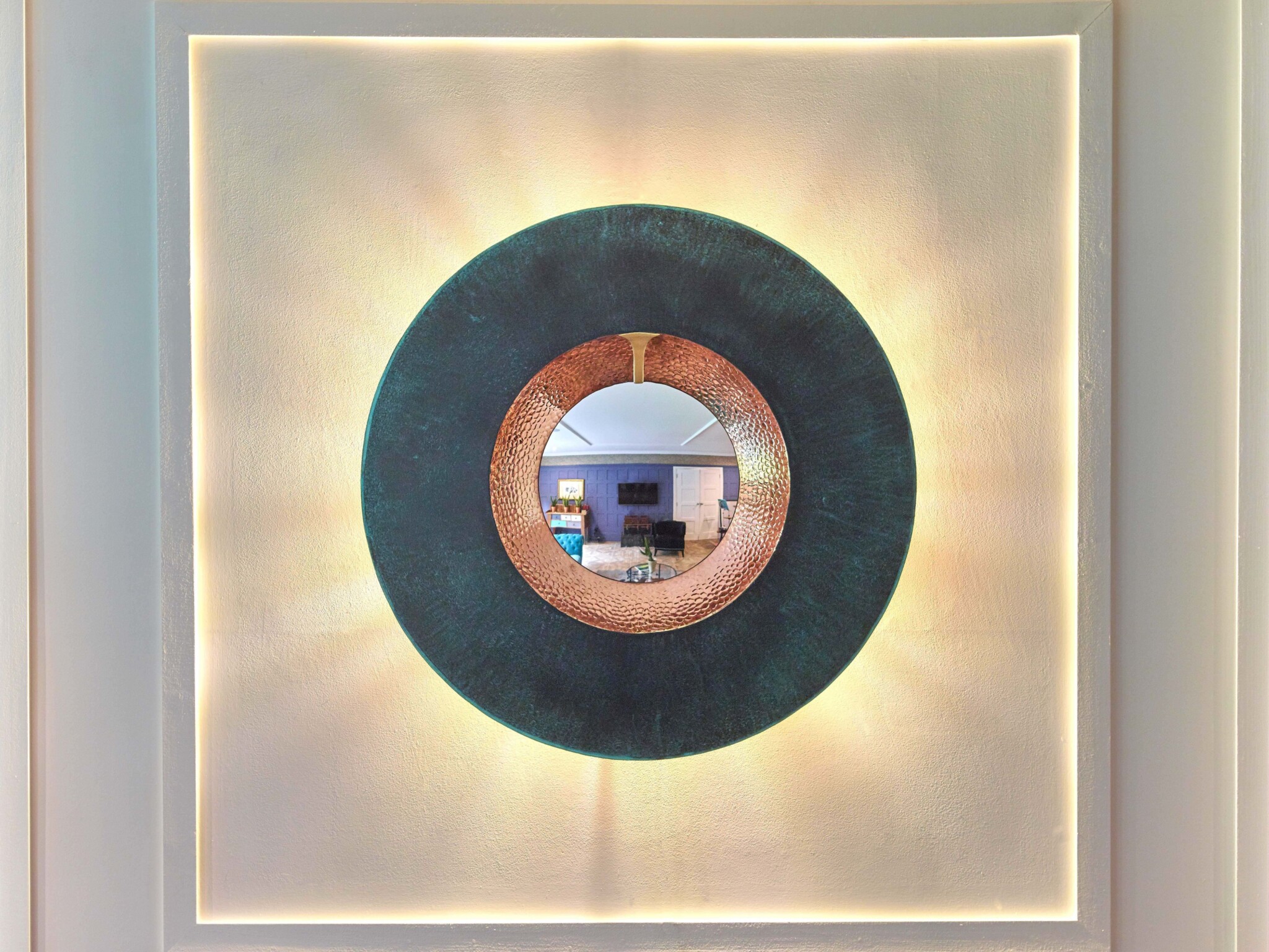
One way of avoiding uplights, downlights and the like is by choosing indoor sculptures that are self-lit. David Harber’s Mirage is a case in point. Handmade from hammered copper with a verdigris patina that adds textural interest, it comes with its own integrated LED backlighting that casts an ethereal, halo-like glow. The concept takes the idea of the traditional mirror and turns it into contemporary metal wall art.
At the end of the day, the only really important question to ask yourself is: does this artwork bring joy to my life? Once you’ve answered affirmatively, it’s purely about how to make it shine and bring zing to your living space.
If you’re still considering what style of indoor artwork would suit your living room, or you’re interested in creating a bespoke design, our team would be delighted to arrange a consultation with you. Email enquiries@davidharber.com to begin your creative journey with us. Alternatively, you can find out more about our Bespoke Service here.
Get in touch
Whether you’ve decided on a piece or you just want to sound out an aspect of our work, please get in touch with our team to discuss your needs.